The Transportation Museum of NYC’s Website has a New Look
This Museum’s website went from shabby to chic with a whole new set of design interactions, information architecture, and an updated ticket purchasing checkout process. Our researchers leveraged key insights from interviews, other up and coming museum websites, and various forms of architecture testing to create a brand new site map and responsive design experience for the New York Transit Museum’s avid visitor population.
overview
This case study was a part of an Information Experience Design Master’s Program in which we paired up with the New York City Transit Museum in a bid to redesign their website for both desktop and mobile devices. Our team of three hoped to show the Museum how our work could impact their design, which included conducting various types of user experience and information architecture testing.
The overall project included moderated interviews, a competitive analysis, card sort testing, and tree testing. We used these insights to reorganize the site’s information and to come up with new design wireframes which we tested for usability painpoints. For the final product we reworked the information architecture and design based on the results of usability testing, and created a responsive medium-fidelity prototype to present to the Museum’s director as a a potential option for a full-scale site redesign.
Our main challenges during this process included quickly learning to use new prototyping tools such as Figma and Optimal Workshop, and figuring out the best way to structure the information presented on the website cleanly and coherently.
Background
Client: New York Transit Museum
Duration: September 2022 - December 2022
Team: NGJ Creative (Gaurav Patil & Nouran Sedaghat)
My Role: User Experience Researcher, Information Architect , & User Experience Designer
Problem Statement
“The New York Transit Museum (NYTM) is interested in a redesign of its current website. The website is used to share general information about the museum, its collection, and its public programs, and is an important resource for researchers studying public transportation history.
The website is maintained by volunteers, and has expanded over time without a clear vision or strategy for organizing its content and information. The NYTM would like the redesign to focus on four key aspects of the design and functionality that are in need of improvement:
Streamlining the navigation
Optimizing the site for mobile use
Improving the ticket purchase experience
Polishing the visit/education experience
Modernizing the visual design of the site”
Our PROCESS
• Moderated User Experience Interviews
• Competitive Analysis
• Card Sort
• Tree Testing
• Design Thinking & Architecture
• Task Flows/User Journey Mapping
• Wireframe Sketching
• Low-Fidelity Usability Testing
• Mid-Fidelity Prototyping via Figma
Moderated Interviews
To kick off the project, we completed six moderated interviews with avid museum goers, discussing their thoughts and opinions upon visiting a museum. Users were screened via a prior survey.
We asked questions such as, “What is the most interesting part of a museum to you and why?” “What online resources do you typically use to plan a museum visit?”
The goal of these interviews was to gain a broad understanding of someone’s entire experience with the museum from start to finish, but especially related to what resources and information they relied on most heavily whilst planning their visit, as well as to create user personas for our target user.
Results
Our researchers learned that the “Visit Us” page and the “Museum Hours” were some of the most important and looked at parts of the site. Users liked to be able to get in and out of a website quickly, and used google and ticketmaster to search for museum events. We also learned that they dislike crowding and were not particularly interested in guided tours.
Food, parking, crowds, and the ticketing process were listed as potential painpoints, and users wanted tickets to be quickly, clearly, and easily accessible. This information helped to form to basis of our design decisions and what we wanted to focus on in further research, such as the competitive analysis. Our User Persona was based on a young adult professional who enjoys traveling and visiting museums in other cities. Museum-going is a social activity to enjoy with other people, and she usually visits museums with 2-3 other people.
Competitive Analysis
Following our interviews, we ran a full-scale competitive analysis of other museum websites in the area that we determined were most similar to the New York Transit Museum. Our analysis was broken up into a three-scale rating system, and each website was throughly combed for various types of features and additional information listed by each museum. We also gave a presentation on the results to our peers, and discussed some of the things they had noticed throughout various sites.
Results
Some of our most prominent results included:
Ensuring that the navigation is dynamic, and that key information such as hours of operation and current exhibitions should appear prominently, in a clear and logical manner that considers the user.
Making “Plan Your Visit” and “Buy Tickets” pages easily accessible to the user, and ensuring they were some of the most modern and cleanly designed parts of the site.
Having important details, such as visitor policies, pricing, discounts, and what each ticket includes readily apparent for user review before any money is exchanged.
Having the site be colorful and engaging, with a clean, easily navigable menu, and well-broken up sectioning.
Retractable information sections gave websites and users an extremely useful additional tool.
Card Sort & Tree Testing
We then conducted an extensive card sorting study to help us to rework the information architecture of the website. Our team took every page on the current NYTM website and broke them down into descriptors, to ensure that no information was lost. We then had seven participants sort the descriptors into what they believed were the most closely related categories. Participants were screened according to how often they used museums, and were asked to arrange 55 cards.
This testing, and the categories our participants naturally created, was then used to determine a new menu structure for the museum. Once we had determined our newly arranged information structure, we conducted a tree test to ensure that even the most obscure information on the site was easily accessible using 9 clearly distinguishable tasks. For example:
“You're interested in joining the museum as a member, but you're only interested if they have good membership benefits. Where would you look to find out about what they offer their new members?”
“Your office is having their annual party and you want to rent out the Museum for a private event. Where would you look to find information for your office party?”
Results
Some of our results included:
Finding “membership information”, how to purchase tickets, and “plan your visit” information was easily accessible and abundantly clear.
Users had difficultly finding the “donations” section.
User had difficulty locating “at-home activities for kids” within the on-site “private tours and events” section, as well as difficulty distinguishing between “on-site” and “off-site” information sections.
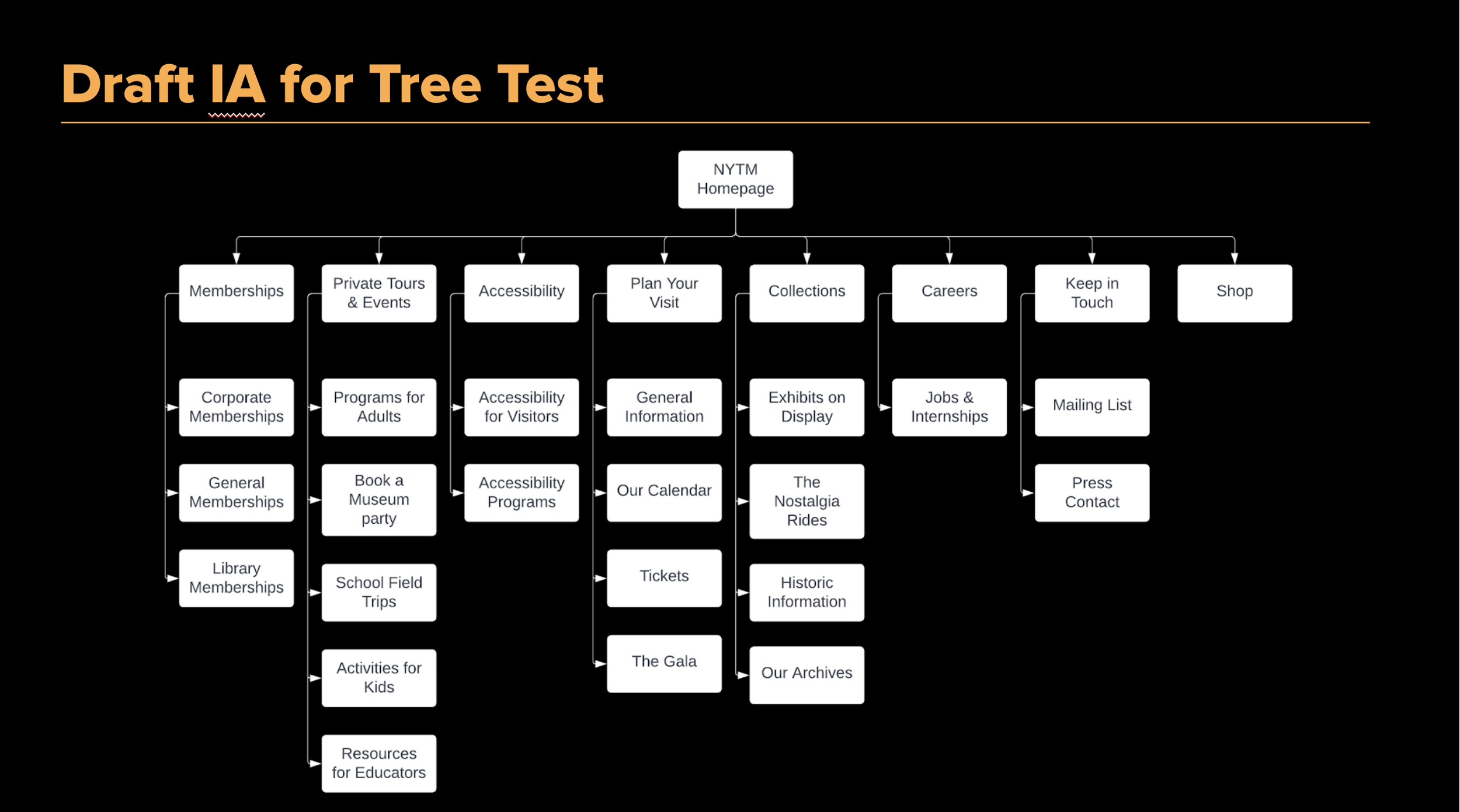
Armed with these results and more, we formally reworked the information architecture to create the following site map, global navigation menu, and header and footer information. “Careers”, “Keep in Touch”, and “Our Calendar” were moved into the Footer, while “Tickets” was put up front in the header section, as one of the first things to appear on the site. These changes were determined via our competitive analysis and looking at common practice ways of shortening and clarifying the navigation, as well as what information in our user experience interviews determined were most pressing and useful to visitors.
Our final site map is as follows:
Wireframe Sketching & Usability Testing
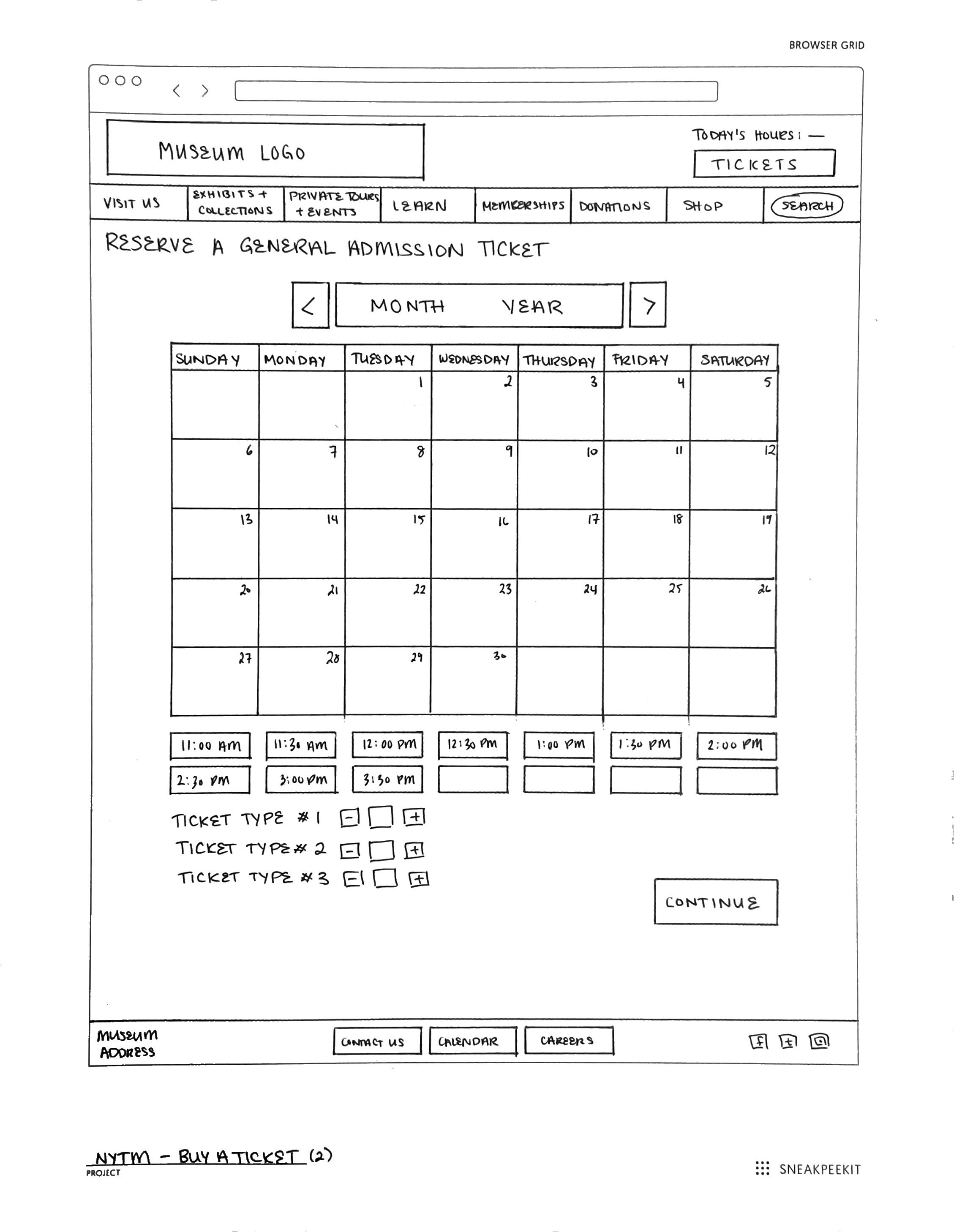
Using our finalized information design, the team began sketching low-fidelity wireframe sketches in order to keep the website’s clean “train”, aesthetic but also to update and modernize the design including the various tips and tricks that we had learned as a class. Both mobile and desktop wireframes were drawn out, as well as two unique task flows for potential users to accomplish.
Once the design had been completed, we began usability testing on a low-fidelity prototype in order to determine any obvious issues or questions users had when completing basic museum website tasks, such as purchasing tickets.
Results
There were some significant results including:
Making sure that the “ticketing” portion was interactive.
Simplifying down the global navigation menu further.
Ensuring that the pricing and basic ticketing policies were clear, engaging, and easily readable on the page.
Tying the calendar to the dates and times in the “selection” sections.
With these results our team moved into the final medium-fidelity prototyping with fully filled out sectioning, iconography, typography, and buttons.
Final Mid-Fidelity prototyping
The final step in our project was updating the design regarding our findings, and creating a mid-fidelity prototype to present to the Museum.
Using all of the information and analysis that we had done, we finalized our design and created an interactive desktop and mobile prototype to present to the Museum director through the website application Figma. We received some concrete feedback from classmates, and took another look at how our prototype and design could be improved.
Next Steps
Regarding next steps, it would be ideal to be able to build out more of the menu pages, and to get better feedback on some of the website interactions before building out a final high-fidelity prototype. Our team learned a ton about creating interactions in Figma, and the best way to structure our designs in the future, as well as incorporating better intuitive thinking into our design process.
We’re currently preparing to present our design discoveries to the Museum Director herself, and are looking forward to the Museum staff’s reactions and comments on our proposed design and navigational changes.


![M1.a General Information [Closed].png](https://images.squarespace-cdn.com/content/v1/5d10e9ff34a45d0001145e02/1670645526203-P96DYLJJL1P4BIVQFJHT/M1.a+General+Information+%5BClosed%5D.png)


